This post is adapted from a presentation at nginx.conf 2017 by Luca Passani, Chief Technology Officer of ScientiaMobile. You can view the complete presentation on YouTube.

My name is Luca Passani. I’m the CTO of ScientiaMobile. A few years ago, we launched a module for NGINX open source, and this year that module has been certified by NGINX for use with NGINX Plus. We are very proud of that. I’m here to tell you guys about what the module is, and why it’s relevant for a lot of companies.

I’ll start by giving an overview of what device intelligence or device detection is in general.

Let’s say that device detection helps with a lot of issues when connected to the mobile web – accessing the web through mobile devices such as smartphones, tablets, and any kind of user agent.
You want to look at device detection when you’re optimizing the user experience on mobile devices. This applies to delivering a smaller image to mobile devices, to providing different navigation for mobile devices that don’t have a mouse and/or a keyboard, and to having a better understanding of the demographics of your system.
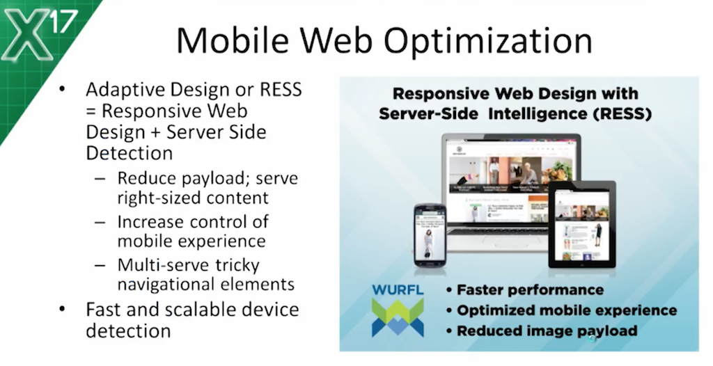
A quick question: who here has heard of Responsive Web Design? Please raise your hands. Yes – a good 80 percent of you. I didn’t expect anything less. Maybe I expected a little bit more, because Responsive Web Design has been around for some time.
There was a time, before Responsive Web Design, when someone needed device detection in order to do mobile content. That was before smartphones and before media queries. Companies would deliver a mobile experience by creating an m.dot website or a dot mobile website that was navigable on mobile devices.
Now, the arrival of Responsive Web Design has tempted a lot of companies into having a one-size-fits-all user experience for mobile as well. But, as I will discuss in more depth later in this presentation, you’ll see that there’s more to creating a great a mobile experience than Responsive Web Design.

Going back to the use cases for device detection: in addition to the web experience and to the user experience which has to be enhanced for mobile devices, device intelligence is also about creating a better understanding of how your users are using your system. For example, we integrated one of our products called WURFL.js with Google Analytics, and we realized via one of the dashboards that mobile traffic – smartphone traffic, in fact – had dropped a zero. This was because we had introduced a mistake in the responsive template. Thanks to the analytics, we could understand that something big was going on. The loss of smartphone traffic was otherwise getting lost in the logs.

We also have other products; ones that, for example, deal with reducing the payload on mobile devices. We’ll discuss that in more depth later.
A huge use case for device detection is, of course, the whole adtech industry. Creating banners – not only the size of the banner itself, but also targeting users based on their device and on the features of the device – some obvious, some less obvious – is a key component for the whole adtech industry.
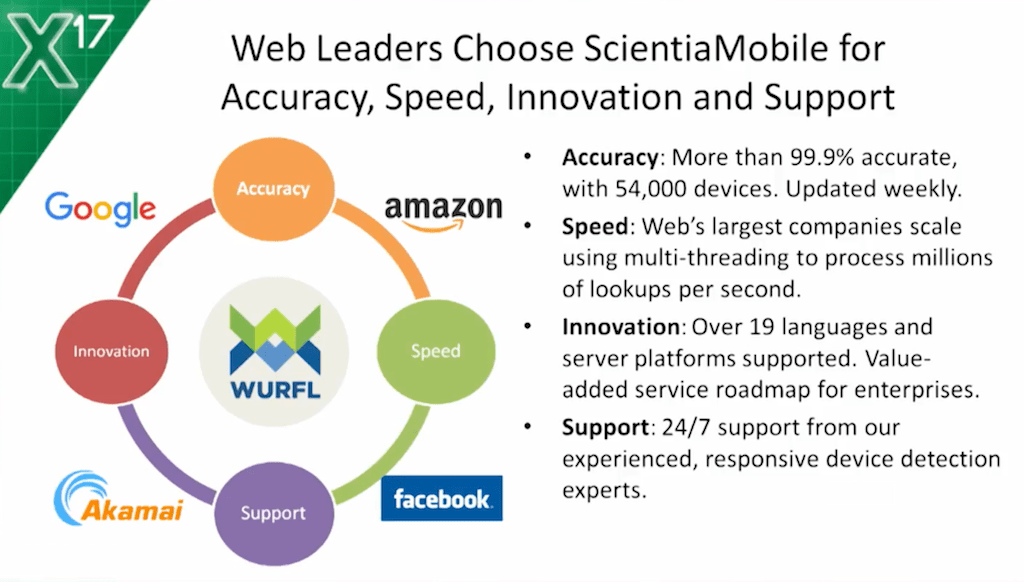
If you look at this slide, you may suspect that I just like to drop a few big names. But this is the reality; these are the companies that use our software for their device detection needs: Facebook, Akamai, Google, Amazon, AWS. The reason they do is not only because the software is good and the solution works, but also because we’re a US-based company and we have fully-fledged engineering and fully-fledged support teams.
Whatever issue you have around device detection, we’re there to listen, to improve, and to work with our customers to fulfill their needs.

Now that I’ve given the overview, let’s look at how WURFL works under the hood in a little bit more detail. This used to be an animated slide, but I can only use 30 seconds here to let you know that when an HTTP request comes in, our software will do a bunch of analysis of the HTTP request – mostly the user agent – and it’ll find a profile corresponding to that user agent. Then, you can also find all the properties, and those properties are returned to the developer, or to NGINX, through an API.
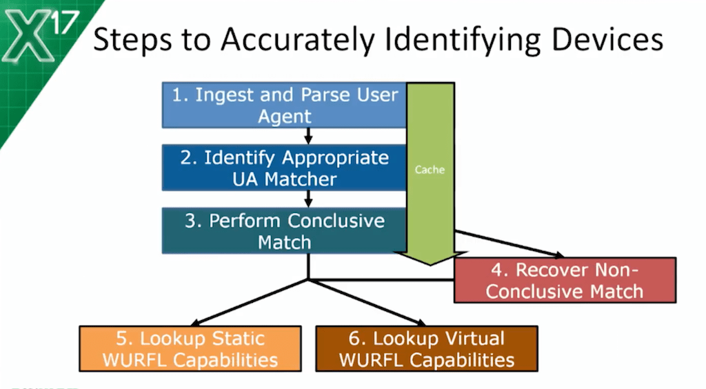
I could use five minutes on this slide to explain in more detail how the API works under the hood – all the logic to analyze the system, to analyze the HTTP request – but the take-away point is that we do a lot of analysis, not only to identify the actual device, but also to avoid false positives, which is really key in a lot of different scenarios. And there’s a caching part to improve performance, and all of this.

So, coming to the most relevant part of the presentation, how does the WURFL module integrate with NGINX?

The first example that I have for you guys today is the FastCGI integration. The red lines in the configuration are the lines that import the WURFL module into NGINX. The WURFL.zip file is the file that contains all the data, and it needs to be updated now and again to get new definitions of new devices that have come on the market over the last few weeks.
The blue settings are about the in-memory cache that you want to give to the module. Usually, most people will not play with those settings, but you can do it if you have some specific reasons for why you want to increase the speed – the speed versus memory dichotomy, as usual.
The really relevant part is the black lines where I tell WURFL, “Give me the value of this property: is this client a tablet; is it a smartphone; is it a mobile device; what operating system is it running?”

Once I have these properties, I can do the integration with FastCGI – this is probably very familiar to most of you – and instruct FastCGI to make the WURFL properties and the device detection properties available to the FastCGI environment.

This means that the PHP developer downstream can easily look up those properties in their application.

Another important use case is image resizing.
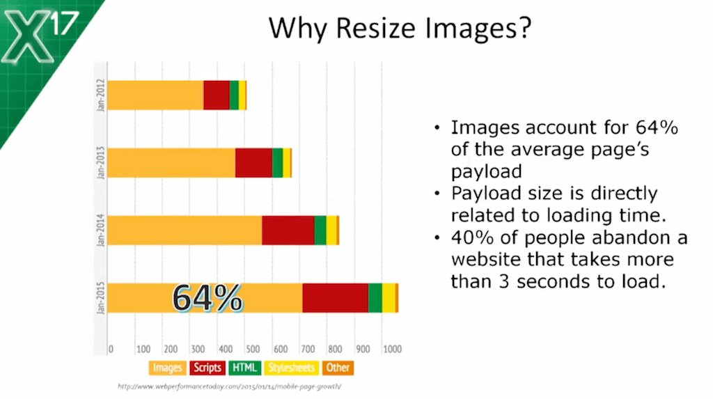
This is a bit of an old slide. I’m sorry I didn’t get one that’s newer because this one refers to data from a couple of years ago. Already, a couple of years ago, your average web page was 1 MB, and that’s a lot for a mobile device. If you look at the same data today, you’re probably around 2 MB. But the key point is that 64 percent of that payload is images. You don’t want to send 2 MB of stuff to a mobile device, because even if you’re using WiFi, even if you have a top-notch mobile device or smartphone, even if you’re using LTE, once that payload is delivered, you may find yourself trying to scroll and the device won’t scroll.
So, you have the paradox of a responsive website that is not very responsive, if you will. It’s probably happened to you – trying to scroll, to zoom, and the device just isn’t responding. You want to avoid that.

This scenario solves the problem by using NGINX. The scenario assumes that you have a component in the network that can resize images for you.
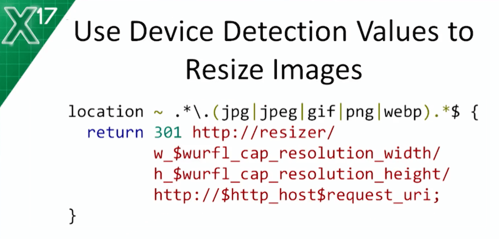
With WURFL, you query a couple of properties – the resolution, width, and height of the device – and you use those properties for requesting a resized image from your network component.
This would effectively solve the problem of multi-serving the same image in different dimensions to different clients depending on the actual capabilities of that device.

Another use case is load balancing – you probably know way more than I do about load balancing.
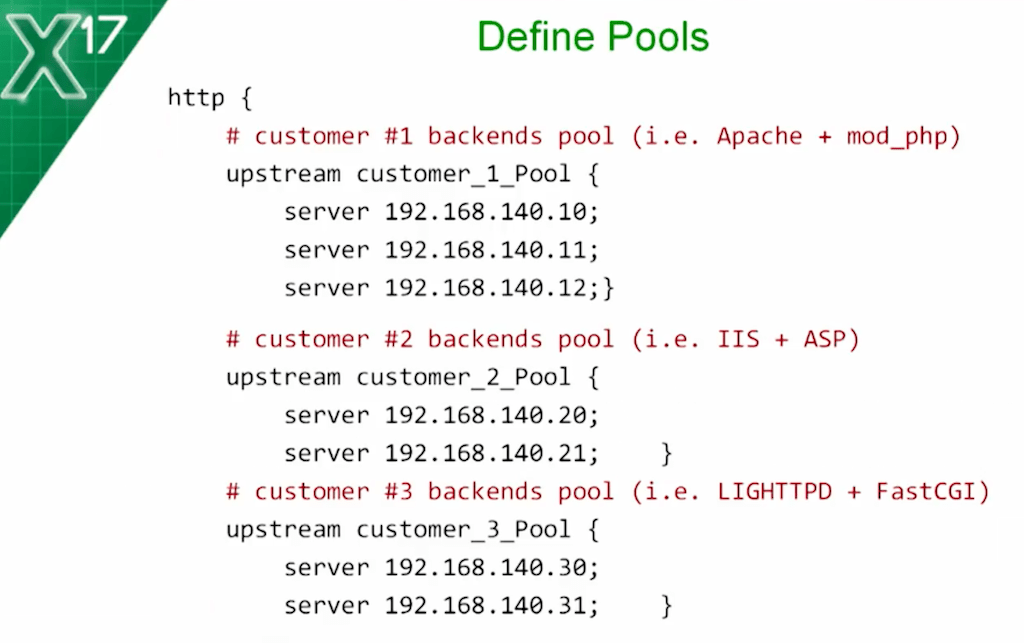
With the WURFL module, you can still do load balancing, but you can do it with policies that are not normally possible with regular NGINX. This is nothing special – just three server pools for load balancing, and by the name, you’re probably already guessing what I’m getting at. There’s one pool for smartphones, another one for tablets, and another pool for everything else.

What I’m doing here: I’m using smartphone and tablet properties to map the pool of servers that will handle the request. This is where the magic is because this slide is the proxy_pass. I imagine it’s no secret to anyone here that the function of this is pretty clear.

Now, there’s a new use case: the missing headers. The point here is: wouldn’t it be awesome if HTTP came with extra information answering questions like: “Is this device a tablet?” “What’s the price of this device?” And, “What’s the screen size?” These are all properties that aren’t part of the HTTP request, of course, but that would be really useful for developers downstream.

So, we created a scenario here where a large organization has a lot of departments, and each department has selected their own platform for their web needs. One department has Apache plus PHP, another department still uses Microsoft with Active Server Pages, and yet another department has lighttpd with FastCGI.
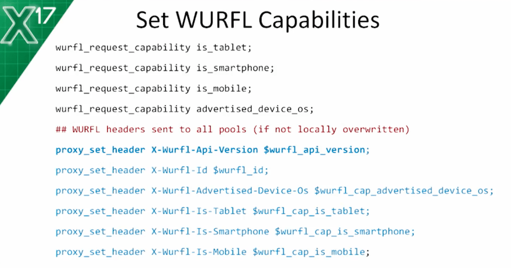
What we do here, thanks to the WURFL module, is: create new headers, and piggyback those headers to each and every HTTP request that goes through NGINX.
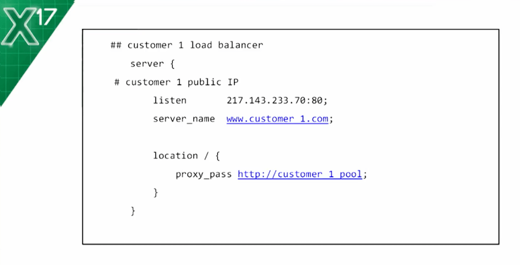
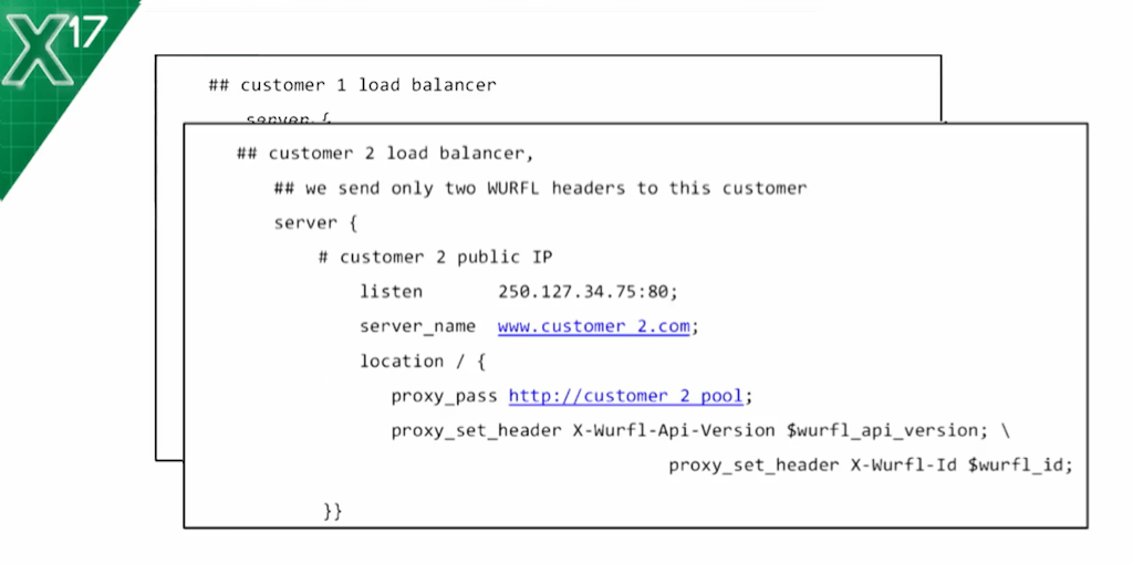
Then, of course, the same thing – I can do the proxy thing and decide if I just want the sum of the headers to be available to some of the departments.

Anyway, the point is that with this mechanism, then, the different departments will still be able to use their existing frameworks to create mobile applications, and these mobile applications will be able to use enriched HTTP that is being delivered by NGINX.

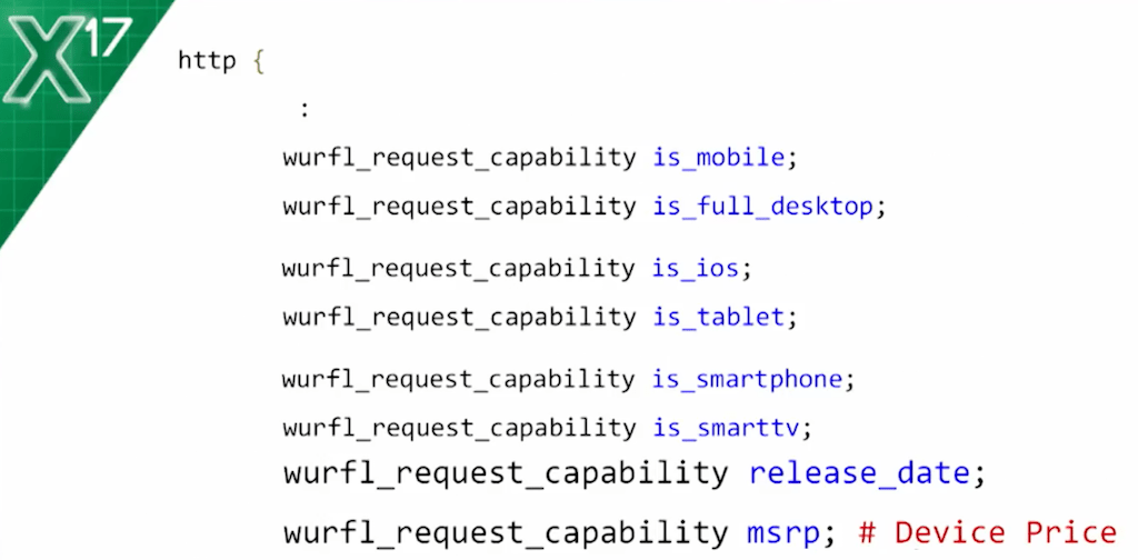
Just to give you an example of which properties are popular, the first six are the ones I’ve already mentioned in the presentation. The last two are interesting because you have the release date of the device and the price of the device when it was released to market.
In the adtech industry, they’re able to map this information. They’re able to relate this information to the propensity of a user to actually buy mobile content now. It’s not at all obvious how to extract the price from a user agent, for example. In fact, you can’t. Part of our work is to constantly be on top of the evolution of the device market, and to constantly make sure that this information is being maintained in our device repository.

I already mentioned Responsive Web Design. I mentioned the problem with the payload, the size of the images that get delivered to websites, which is not ideal for mobile devices. I think there really is a question if everyone has flocked to responsive because they assumed that was a solution.
Let’s take a step back and say, “What was the problem again?” The problem was really to make websites usable on mobile devices. And if that was the problem, Responsive Web Design is a step in the right direction, but it’s not the complete answer. It’s not the complete answer because of the problem of delivering these large pictures to mobile devices.
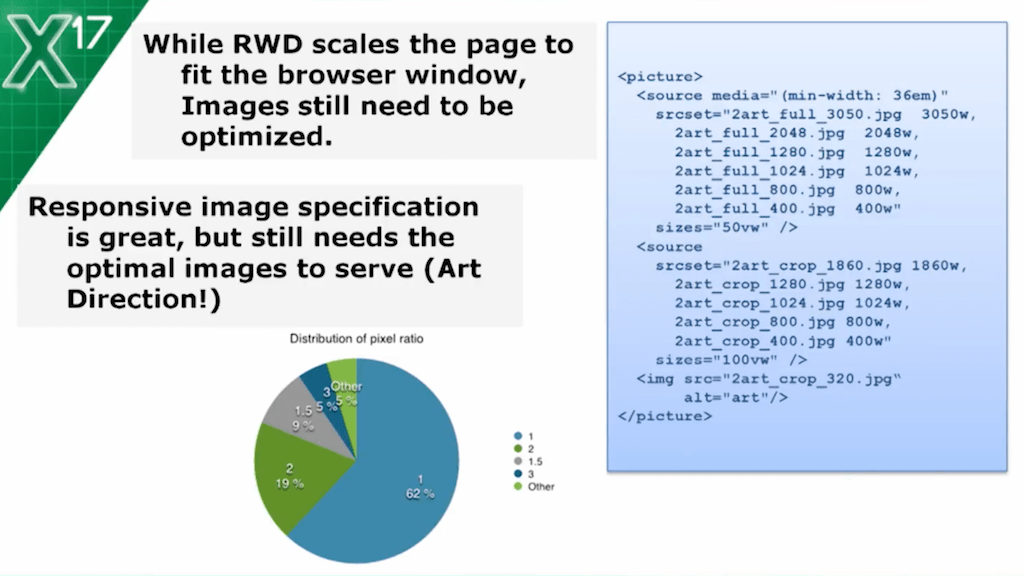
One question you guys may ask is, “Luca, if the problem is so big, why haven’t the standard bodies addressed the issue in some way or form?” The answer is that they actually have. Some of you may have heard of the responsive image specification that augments the image tag and introduces the picture element to test the browser. Look at what you’re running, and depending on whether you have retina display, or on how big the screen is, just select a different version.
This one may appear like a solution, but it’s really not because it’s just moving the problem from being a technical problem – how do I specify multiple pictures in HTML? – to being a problem of art direction – having a team of people optimizing, resizing, changing the size, and producing multiple versions of the same picture for mobile devices. Even large companies usually have a problem coming up with those teams – just having two, three, or four people whose job is just to constantly adjust the images manually.

We, as a company, have a product that addresses this problem. It’s called ImageEngine. ImageEngine really sits on three legs: mobile device detection, which we’ve already discussed; a component to do image resizing; and a content delivery network that caches that content as close as possible to the user.
When I talk about image resizing, I should actually call it image optimization, because it’s not only about the size of the image, it’s also about optimizing the format.

What does that look like for a developer? There are really two ways to use ImageEngine: you can replace your URL to pictures with a URL to ImageEngine that piggybacks the URL to the actual image, and that tells ImageEngine, “Look ImageEngine, I know you’ll do a good job of giving me the picture that’s best suited for every mobile device. Go ahead and do it for me.” Then there’s another way, which is to start providing specific directives to ImageEngine so that it can do exactly what the programmer is telling it.
Of course, you can use the WURFL module that I’ve just introduced together with ImageEngine to come up with your own custom policies for serving images. For example, if you’re producing scientific literature, you may want certain pictures not to be resized because you want people to be able to zoom in and look at details.
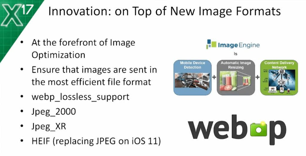
Important point: ImageEngine is not only about the size, it’s also about the format. That means that, as new formats arrive on the market – webP, JPEG 2000, and also HEIF, which, as Apple is planning, will replace JPEG on iOS 11 devices – if you’re using ImageEngine, you won’t need to go back and change legacy content for the new formats. You can just assume that ImageEngine will do that for you.
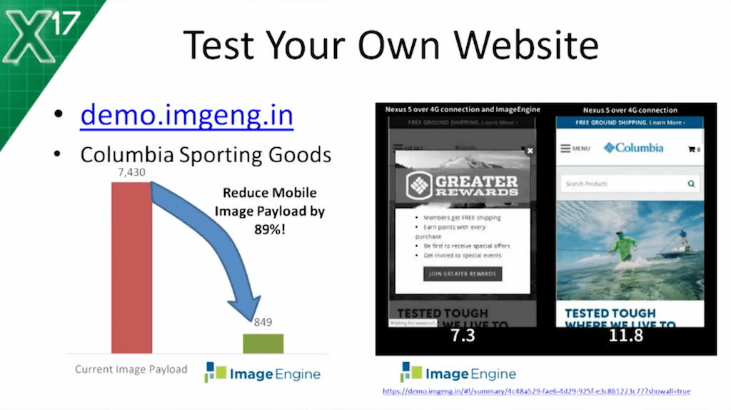
If you have a company website, you’re welcome to visit demo.imgeng.in. This will show you how ImageEngine can optimize your website.
I have a video – real quick. It shows just one website – this one in the slide – and it shows how it takes about seven seconds, once it’s optimized, and longer than 12 seconds without optimization. You’re welcome to do the same on whatever site you like.
This slide shows an 89 percent reduction in size. Typically, you have something around 60-65 percent payload reduction.
This is pretty significant, also because those seconds that are saved to access the page mean money for ecommerce – pretty much for every website that doesn’t want to see their users go away.

Links from slide above: WURFL@ScientiaMobile, ImageEngine, WURFL NGINX Plus Module.
Here are the resources for the things we discussed today. If you have questions, I’m here.
Oh, excuse me guys. I forgot to say one important thing. We are Silver Sponsors. We have a booth on the other side of the hotel. You’re welcome to come by and we can tell you more about our content and about our products. Steve, Joe, and Jonathan, can you please stand up for a second? You’ll either find me or one of my colleagues there, and they’ll be more than happy to scan your badge and answer any questions you may have. Thanks.
Q: Is there an industry demand for this, and are there adopters?
A: The answer is yes, there is a lot of demand, and there are a lot of adopters – particularly in the world of e-commerce, because e-commerce is really where two or three seconds’ difference looking at the catalog of products translates directly into thousands of dollars per day, or hundreds of thousands or millions of dollars per year, in lost revenue.
I’m sorry, guys. If you’re raising your hands, I’m not seeing them. I don’t think I’m seeing any hands, so I think that’s it. Thanks a lot for your time.


